Wednesday, December 8, 2010

AIGA Poster


I did a rubbing for the background. I looked up what the convention center looks like and there it one
building that is in the shape of a triangle towards the top so thats where the triangle came in.


GeniusLoci Poster


Friday, November 19, 2010

Gig Poster 2


Things to fix: take the letters off of the microphone and maybe fix the letters to make them look more like writing.

Wednesday, November 10, 2010

Gig Poster (Before Final Adjustments)


The stripes need to be more even and probably more transparent. The white stripe and arrow need to be a little bigger and the arrow filled in. The textured background also need to be more pronounced.

Textures


Wednesday, October 20, 2010

Study, Don't Study

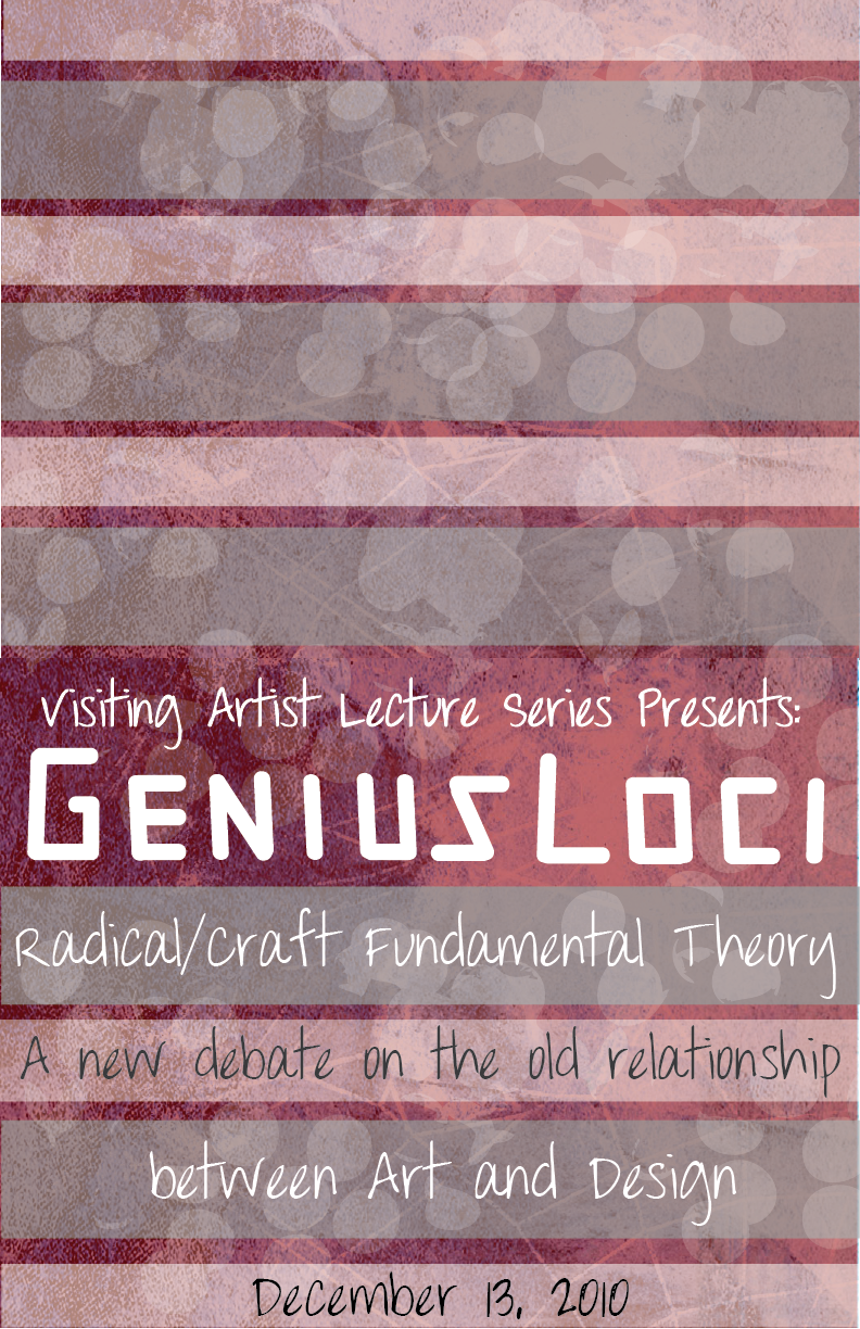
This poster was done in the same color scheme and detail and my original poster.
Its simplistic but I think it gets the message across.

As far as what needs to be fixed I'm not completely sure because I didn't get to meet
with anyone about it.


For this poster I wanted to do a little more detail than the last. The original WPA poster
was very simple and the poster that was inspired by that one was done in that simplistic fashion as well.
For this poster I wanted it to have a little more detail that way it would stand out.

still a work in progress because i need to find another photo to use.


Wednesday, September 8, 2010

Advertising Techniques


Bandwagon
 This technique is usually used to persuade people to join something that other people are apart of. The poster above is telling you that the woman in the photo makes bombs but she is also supporting the war by buying war bonds. The poster is trying to convince the audience to do what the poster says.


Transfer
This technique is used to add a positive light to a product or the provider of a product. In this WPA poster, the market is shedding positive qualities about itself in the way that the storekeeper buys the food brings the food to the store so you can come and buy it. The poster is wanting you to come to the market and buy the products there because the storekeeper is the one who supplies everything.


Testimonial
This technique is used to persuade the viewer to buy the product that is being endorsed by a famous person.  In the advertisement Jessica Simpson is endorsing Proactiv Skincare, this should persuade the viewer to buy the product because she uses it so they should use it too.

Heroic Icons

Uncle Sam
(recruter for Heroes)


Arlington National Monument


The article talks about heroes and what the definition of a hero is and where the word came from. It also says that the hero icon is a very large part of society and it is how we define what a hero is. Heroes come in many forms such as the average man to a more famous icon, Superman. The article also talks about how different countries define what a hero is for example in Germany, the Nazi's who died for their country were defined as an 'eternal German' or in other words a hero. The article then goes on to talk about how heroes are defined in other parts of the world.

Paper Bombs Leaflets


Monday, August 23, 2010

WPA Posters


Travel and Tourism


This poster for travel is consisted of muted colors. The colors give the poster a sense of calm and relaxation and that was the reason for the artist to choose these colors for this poster because when you are looking for a place to vacation to you are wanting to travel to a place that looks relaxing. In photos I looked at of mountains, mountains don't normally look mauve and green but the artist wanted to use colors that would capture the audiences eye because the mountain is the most important part of the poster. The poster is asking the audience to travel to  Montana to visit the mountains there. The poster is convincing the audience to vacation in  Montana by highlighting its landscape.

Community Activities 

  
This posters for the Cattle Feeders meeting is made up of colors associated with farming and the outdoors. The colors are more life like in that they are colors we normally see.  The photographic images of calfs are different than compared to the image in the poster.  The calf in this poster has less details compared to a real live calf. The boot in the poster however is life like just with less details . This poster is asking its audience to attend the Cattle Feeders meeting and it is convincing because what the meeting is about is directly on the poster itself the audience doesn't have to guess.


World War II

  
This poster is made up of primary colors. It grabs the attentions of the audience because it is consisted of such bold and bright colors which in return makes the audience pay attention to what the poster's message is. The images I looked up of submarines do not look like the image in the poster.  The image in the poster is made to look menacing and look like it is on the attack because that is what the artist wanted to depict. The poster is asking the audience to be aware of things that were going on during the time of World War II  for example in this poster submarines would attack ships. This poster's message is convincing because what is important is bold and easily seen by the audience.